Assignment 1 - Getting Into the Flow
Due January 23rd 2023
Assignment:
- Follow at least 3 DataViz blogs via email alerts, Twitter, or RSS.
- Find one interesting data visualization from those sources and write one paragraph about it – why is it interesting? What's particularly exciting or well done about it?
- Which DataViz blogs you decided to follow and why?
In one of the very first weeks of my undergraduate degree, I was introduced to the 'Information is Beautiful' blog and it is now something I frequent. Two Christmas' ago I received David McCandless's book 'Beautiful News' and therefore I almost think it would be cheating to include this in my three blogs for this assignment.
As a visual designer, I really need something to grab my attention quickly and be truly attractive to ensure I stay engrossed in the work. I used this mindset to help which blogs I would enjoy reading regularly. Through this method, I chose: Flowing Data, Lisa Charlotte Muth's blog, and the Data is Beautiful thread on Reddit.
Flowing Data seemed to have a very map-heavy homepage. As my family knows, I love maps and even more so artistic impressions of maps so this blog seemed perfectly curated to my interests. I also enjoyed the simplistic "Browse by ... " features.
Lisa Charlotte Muth's blog grabbed my attention due to the strong similarities between it and the Information is Beautiful blog I mentioned above. Both of these two blogs have an attractive interface with a large amount of white space, allowing the reader to relax and truly enjoy the infographics being presented.
In contrast to these gorgeous, perfectly curated blogs and websites, my third blog is the Data is Beautiful thread on Reddit. The idea that anyone can post to this thread, with any topic, presented in any way really interested me. The wide variety of graphics had me engrossed for hours trying to pick one to write about.
The first one that grabbed my attention was the graphic showing the surge in egg prices by user Metalytiq. The information as such wasn't particularly interesting to me, but the creativity is brilliant. Along with being an aesthetically pleasing graphic, it is also clear about the information in which it is attempting to portray which is always such an important factor in data visualization.
But I couldn't stop going back to this post by Bischrob (shown below), analyzing the NFL Ratings for the 2022 season. Since moving to the States six months ago, I have become incredibly interested in Football and seeing these skills represented simply really helped me get my head wrapped around more of the concepts of the game. It also showed how much this can change throughout the season, in comparison to the Scottish Soccer league which has consistently had the same top 5 for as long as I can remember.
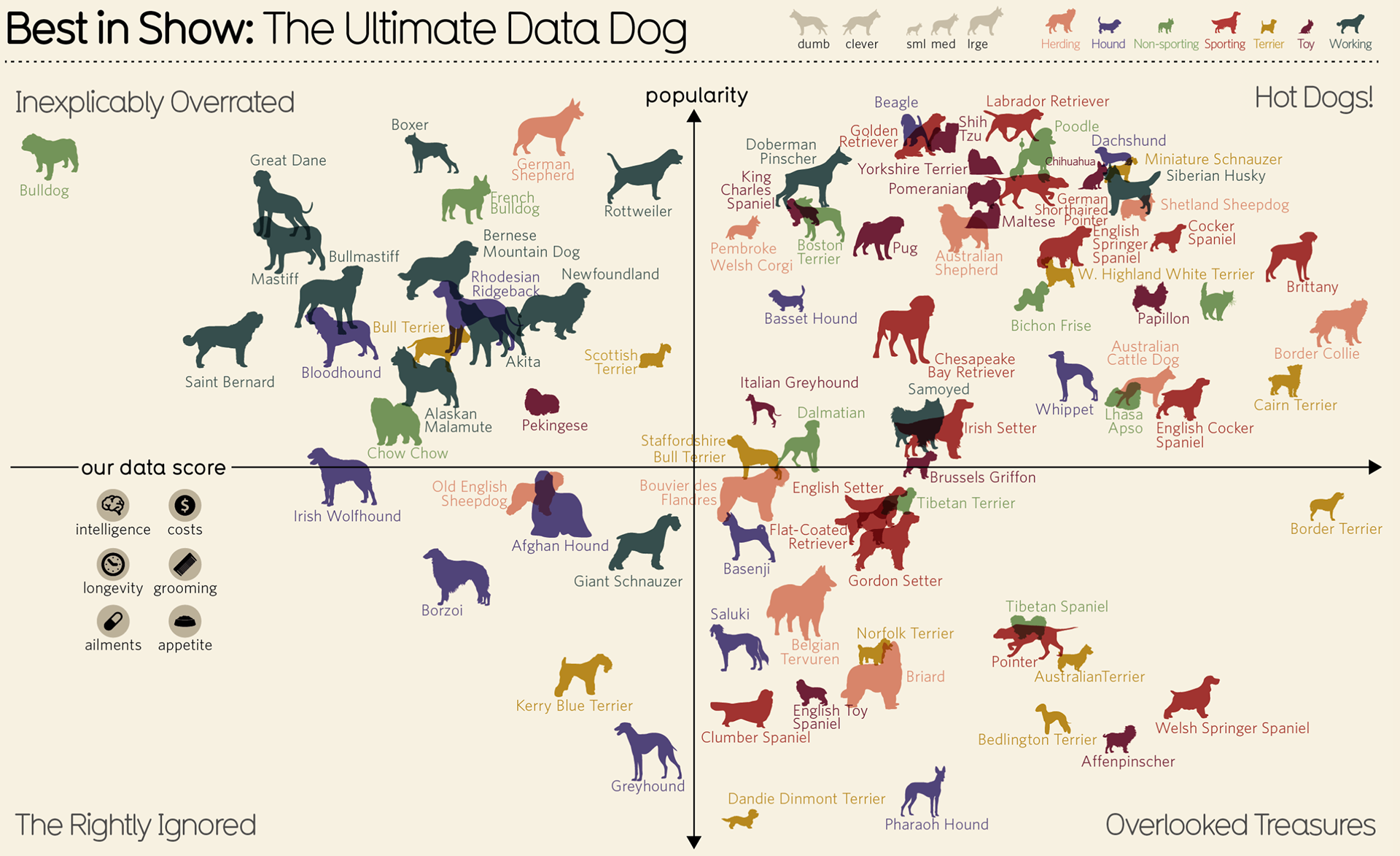
Data is Beautiful: The Ultimate Dog Data
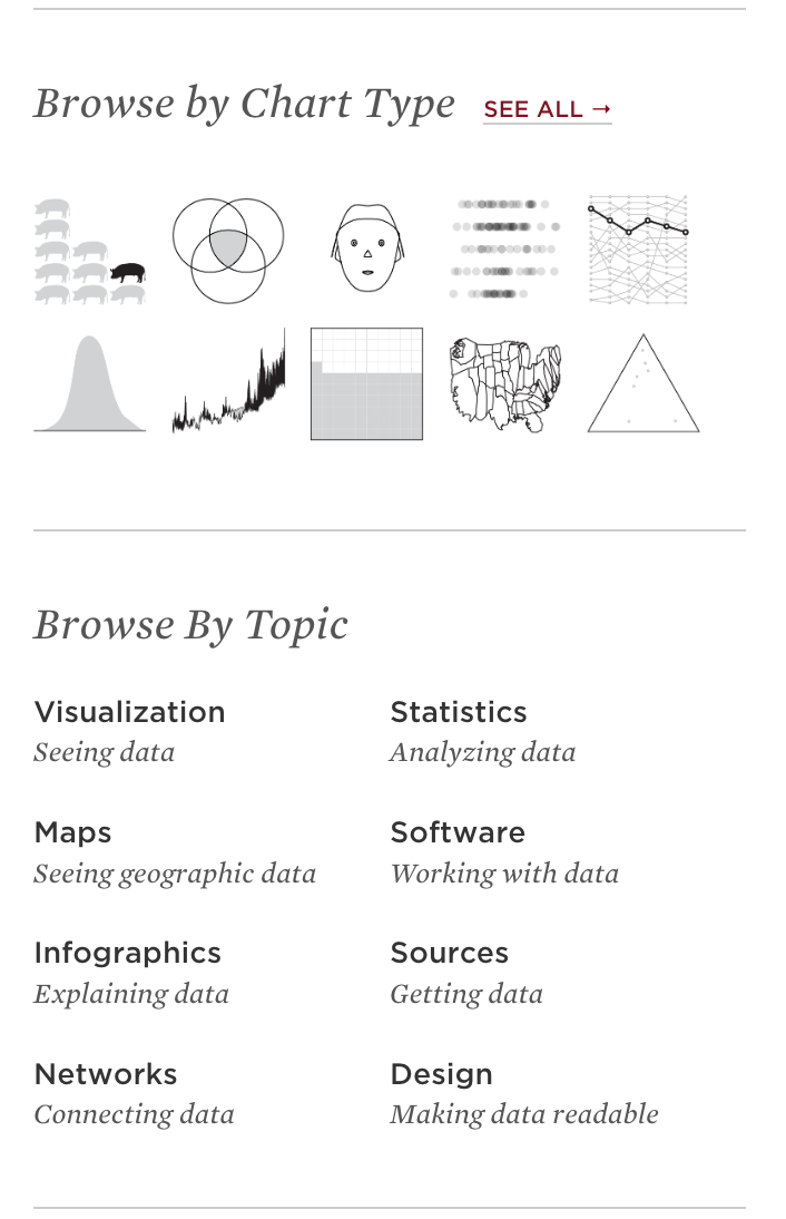
Flowing Data: Categories for a more seamless browsing experience
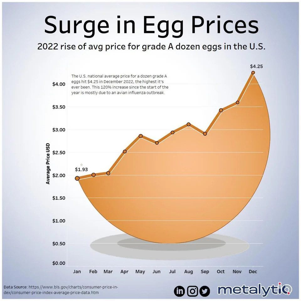
Data is Beautiful post by user: Metalytiq
None of the graphics above belong to me, they are all linked within the post.
Assignment 2 - Comparing By the Numbers
Due February 1st 2023
Assignment :
- Using the website DataUSA in addition to other background research, tell a short data-driven story comparing Boston, MA, and another US City. Use what you have learned so far about writing with numbers as well as avoiding stereotypes.
- Your short narrative should be posted to the class blog and should have 300-500 words
How 'busy' is New York City?
When thinking about New York City it is almost impossible to think about a quiet city, can you imagine an empty Times Square or a quiet Central Park? This is probably due to the 8.38 Million people that live within the city limits of New York City, NY. Boston, MA, only just 200 miles north, has a population of less than 690 thousand people, just 8 percent of that of New York City. When you look at these two big cities on the east coast of America and their population count it is easy to understand why New York is called “The City That Never Sleeps”.
But this is only one set of numbers, and although they are true, they do not provide the whole story. The land area of these cities are drastically different, NYC is 309 square miles whereas Boston is 89.6 square miles, of which 41.21 square miles is water (New World Encyclopedia, 2020). This calculation gives you another number, Boston’s 48.39 square miles is only 16 percent of NYC's 309 square miles.
These numbers are once again true, but not the full story. To try and gain a more comparative set of numbers, the population density of these cities can be calculated. National Geographic defines population density as “the concentration of individuals within a species in a specific geographic locale”. In NYC there is 27,120 people per square mile in comparison to Boston where there is 14,259 people per square mile, which helps us see that New York City is a busy city with lots of people it is only 1.9x ‘busier’ than Boston.
There are also other factors that can contribute to how busy a city is. When many of us think of NYC we think about some variation of this picture on the left but, according to DataUSA, each household has an average number of 0 cars with 52.8% using public transportation to commute. This differs from Boston, with 37.5% of the population driving alone on their commute, with an average of 1 car per household. New Yorkers also have a longer commute, with an average of 41.4 minutes with 7.62% of the population having a ‘super commute’ of over 90 minutes. Only 2.13% of Boston residents have this ‘super commute’.
All of these statistics are true in their own right, but it is impossible to include every variable factor when comparing them. It also makes you question whether New York City is really as ‘busy’ as it’s made out to be, or do they just have a great marketing team?
Sources
Data USA. (2020). Boston, MA. Datausa.io. https://datausa.io/profile/geo/boston-ma/?compare=new-york-ny
National Geographic Society. (2022). Population Density. Nationalgeographic.org. https://education.nationalgeographic.org/resource/population-density
IMDb. (2022, January 7). New York: The City That Never Sleeps. IMDb. https://www.imdb.com/title/tt16975518/
Stanton, M. (2022, August 3). Getting around New York City at any time of year – Lonely Planet. Lonely Planet. https://www.lonelyplanet.com/articles/getting-around-new-york-city
Assignment 3 - Examining Your First Data Set
Due February 10th 2023
Assignment :
Write a short blog post about the dataset from data.boston.gov. answering the following questions:
- Who collects this data set? If it's an organization, which department of the organization? Is there a specific person listed who you could contact?
- Why do you think the organization collects this data? Does it specify how it uses the data?
- What time period does the data set cover?
- What are some questions you have about this data set?
- Who are three types of people you could interview about this data set in order to learn more?
Active Food Establishment License
Who collects this data set? If it's an organization, which department of the organization? Is there a specific person listed who you could contact?
The Health Division of the Department of Inspectional Services, or the ISD, keeps the data of the establishments that possess a food service permit. These permits ensure that the establishments have safe processes for handling and serving food to the public.
The Department of Innovation and Technology is accredited as the publisher for this data set, and they do have a general contact e-mail, but there is not a single author.
Why do you think the organization collects this data? Does it specify how it uses the data?
The site itself doesn't define how it uses the data although I have some thoughts as to why. It is important for the city to keep track of which establishments have their active food establishment license, and when they will need to be renewed. It also feels like an easy 'license' or poster to recreate so it can be used as a point of reference when completing premises visits.
What time period does the data set cover?
This data set is a constantly updated collection of the active food establishment license, it does not have a inactive section. The oldest addition to this set is from December 5th, 2006 and the most recent addition is from January 25th, 2023.
What are some questions you have about this data set?
There a few field categories that do not make sense to me, the initial one being "LICSTATUS". I understood this field as license status, but every field in this column is active. If this data set is only required for active establishments, it seems like a pointless category.
The second one that caught my eye was "DBAName" which appears to be a second field for a name of the establishment although there are only 37 out of the 3013 have completed this field?
Who are three types of people you could interview about this data set in order to learn more?
The first person I would like to interview would be a city worker who is responsible for certifying these establishments and what requirements need to be met to ensure they qualify for this license.
I would also like to interview the owner or manager of an establishment who has one of these licenses and see of they even know that their data is available online and see if has in any way effected they way the run their business.
Finally, I think it would be interested to interview an establishment owner or manager who has recently applied for a license and been denied. It would be interesting to see how strict the process and if they believe it is too strict.
The data set spoken about above is linked here
Assignment 4 - First Chart
Due Monday, February 13th
Assignment :
Create a chart in Tableau using the sample data set provided in class. As you are creating your final map, save screenshots of your process and upload the following to a new blog post:
- Your finished chart
- At least two chart-in-process images.
- A short, one-paragraph description of your process
- Three questions that exploring your data visually provoked you to ask (you don't have to answer the questions)
- At least two chart-in-process images.
- A short, one-paragraph description of your process
- Three questions that exploring your data visually provoked you to ask (you don't have to answer the questions)
The data provided was "Monthly_provisional_counts_of_deaths_by_age_group_and_HHS_region_for_select_causes_of_death", depicting the cause of deaths for different age groups. For this assignment I chose to filter these results by Cerebrovascular diseases as I this set gave a more varied set of results. I tried multiple different displays including 'packed bubbles' and 'tree map' but I decided on a classic horizontal bar chart as it made the data more comprehensible.
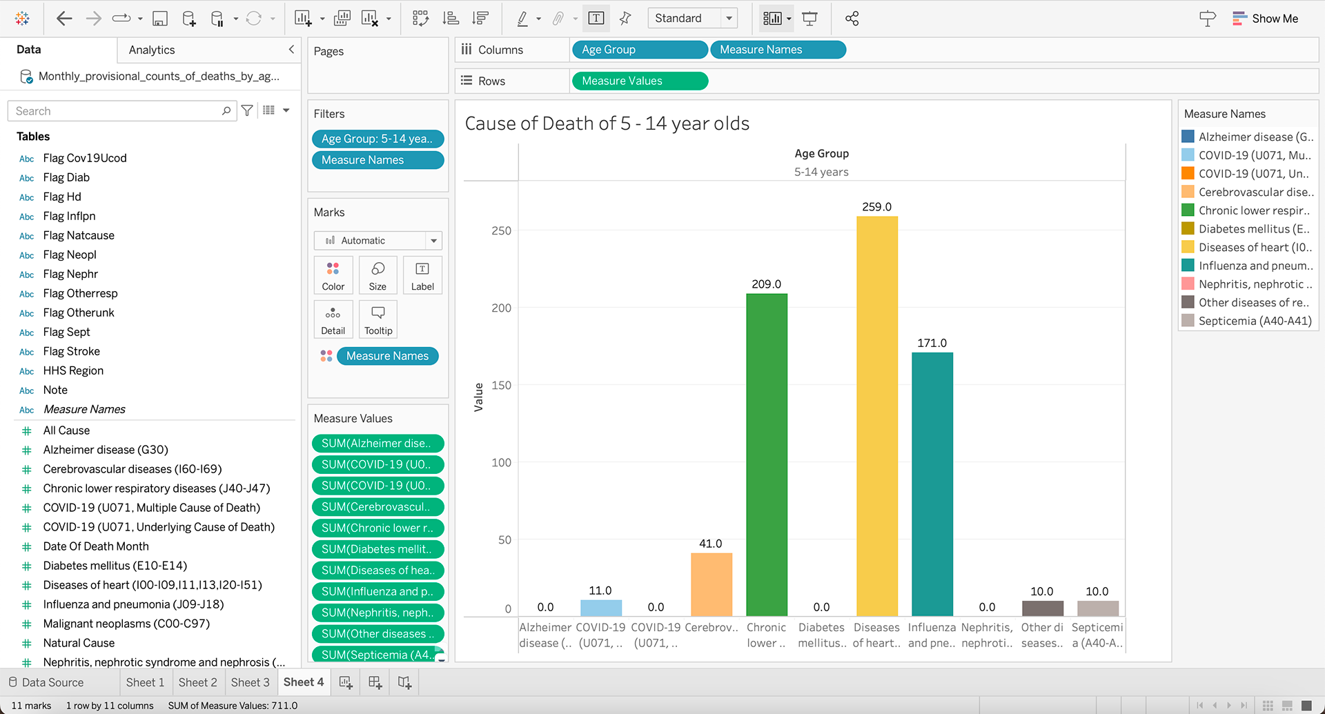
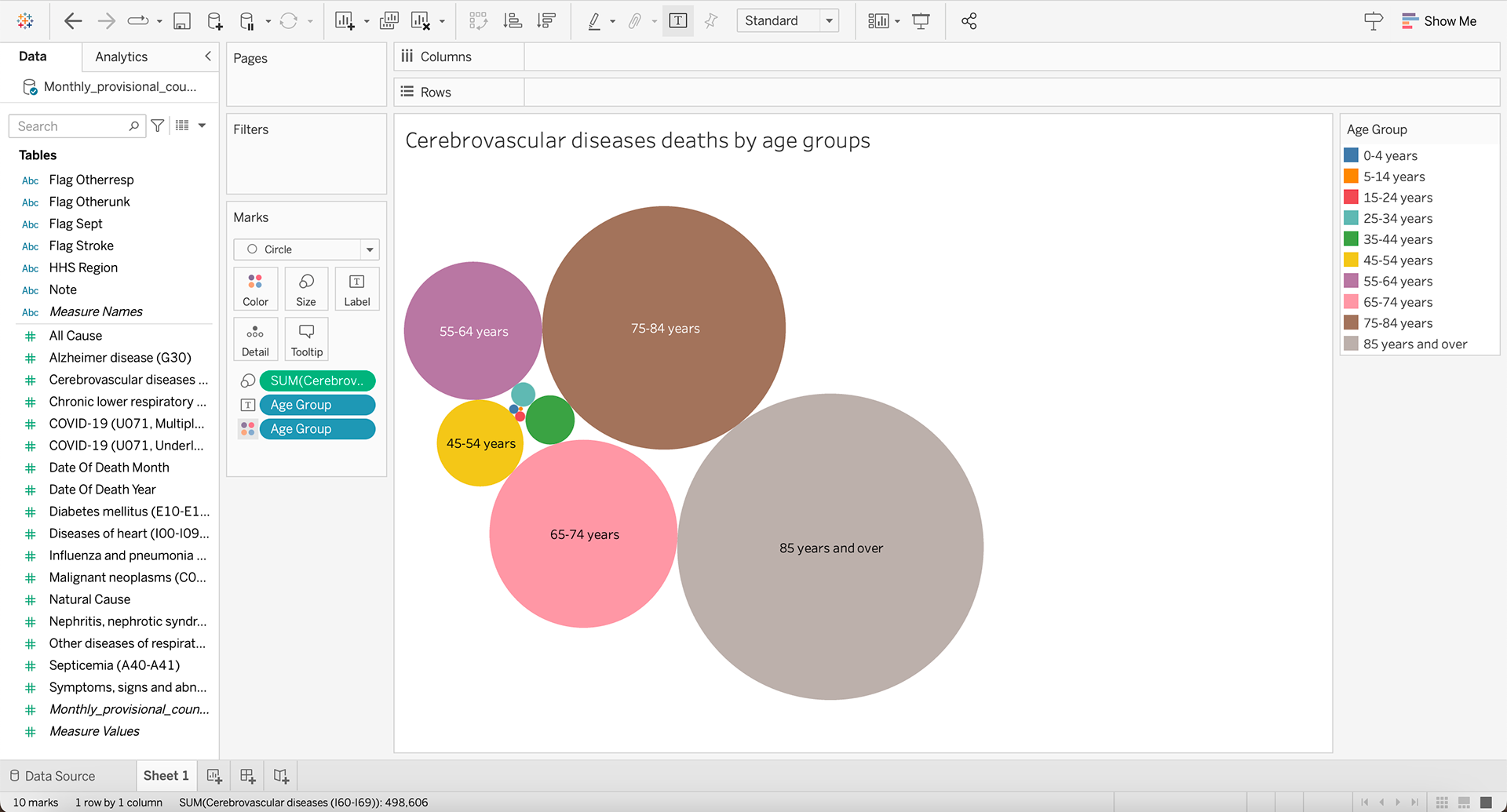
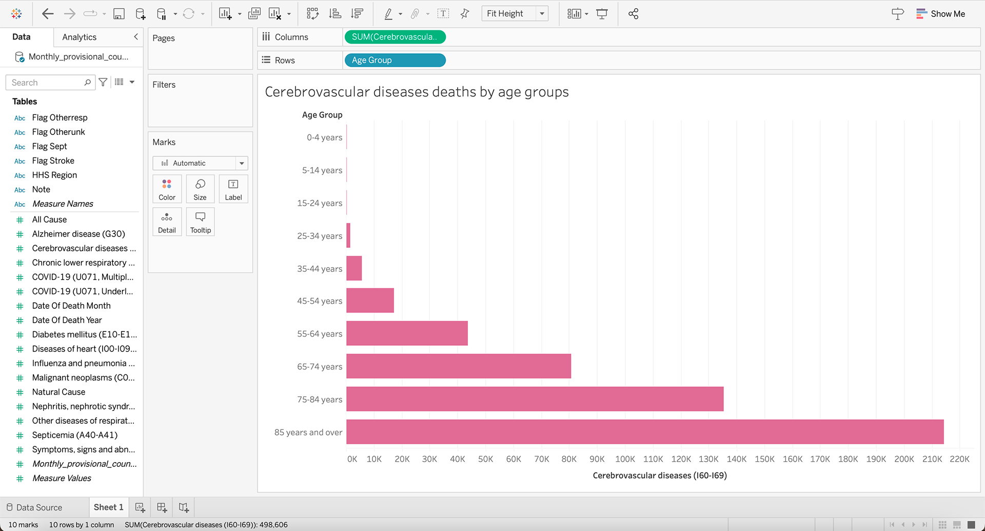
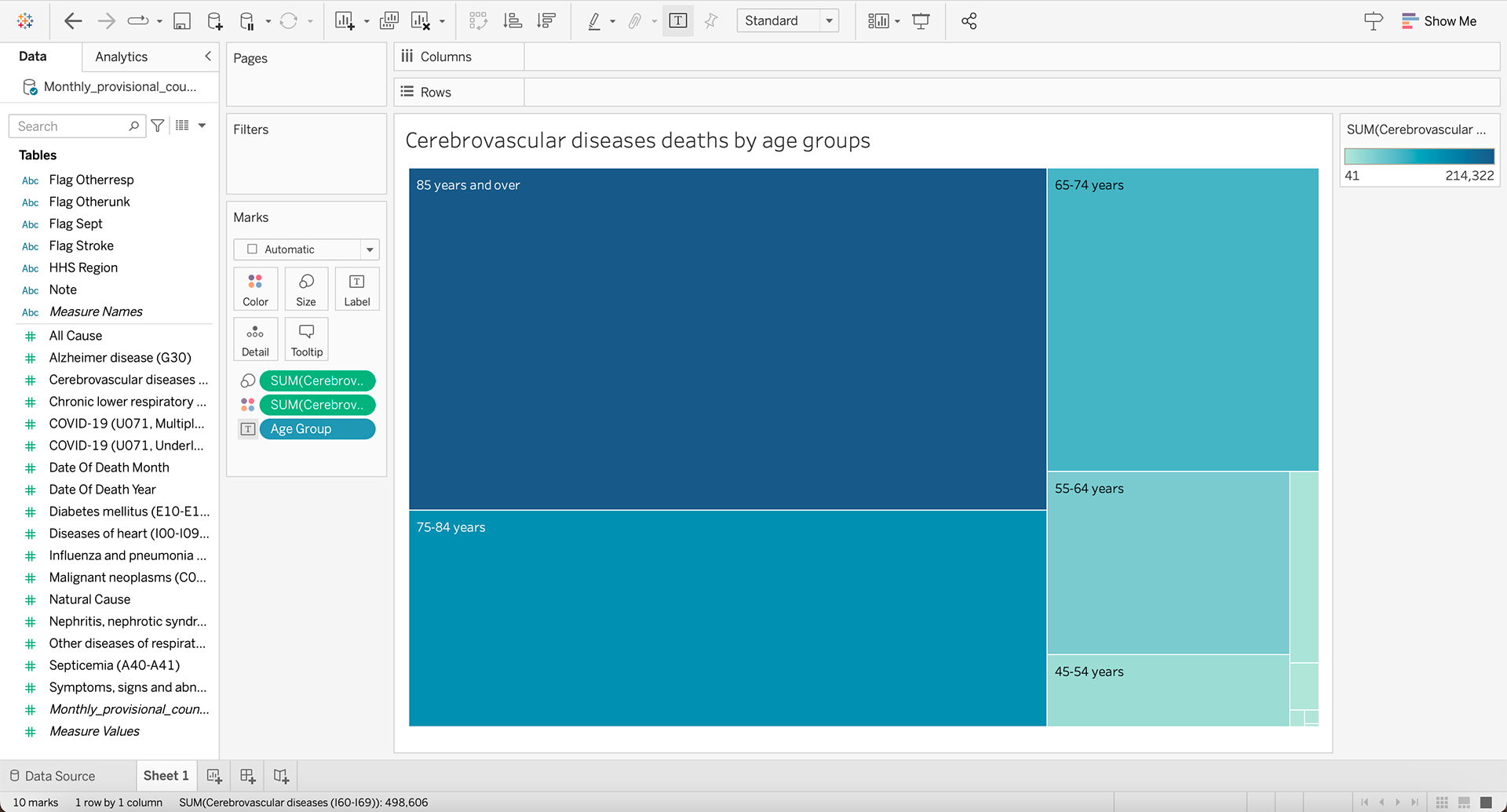
When working with this data, it did bring up a few questions:
- Who collected this data? As it was just provided as a .csv file I cannot find where it originated from.
- Why are 0-4 years and 15-24 years four and five times more likely to die from Cerebrovascular Diseases?
- As this data is collected in the US, I must wonder about the health insurance of those who have died from cerebrovascular diseases? Could this be a factor as to why they are dying so young?
Final Data Visualization
Assignment 5 - Open Refine
Which Boston neighborhood has the most 311 cases in 2022?
Dorchester with 41,800 cases
What is the most common subject in Dorchester?
Enforcement and Abandoned Vehicles with 8,949
What is the most common subject in South Boston Waterfront?
Enforcement and Abandoned Vehicles with 589 reports
What is the most common subject in Mattapan?
Sanataion with 1,419 reports
What is the most common subject in Downtown?
Enforcement and Abandoned Vehicles with 4,623 reports
Which month had the lowest and highest number of reports?
August had the most reports with 26,055 and December had the lowest number of reports with 17,205 cases.
Choose one reason to clean the neighborhoods in Openrefine and visualize it in Tableau.
This visualization shows the quantity of Enforcement and Abandoned Vehicles reports per zip code.
Assignment 6 - Data User Guide
The purpose of a Data User Guide is to orient a new person to a data set so that they can start to make sense of it.
Data Source
Original purpose and application
This data set exists to show the information about shootings that have occurred within the City of Boston and fall under the Boston Police Department jurisdiction. To be included within this data, the incident must fall under certain criteria: this data set contains shooting incidents where a victim has been struck by a bullet, either fatally or non-fatally but excludes self-inflicted gunshot wounds or shootings that are determined to be justified.
The data is collected from the Boston police department for accountability and transparency purposes. They contain a variety of data but they are all collected as a tool to provide the community with data about police interactions within their community.
History, standards, and format
The data in this set was collected by the Boston Police Department, beginning on January 1st, 2015 and it is continually updated with a 7-day delay. The 7-day delay allows for a proper investigation to take place and ensure that the information is accurate. As of February 28th, there are 1,798 pieces of data within this set. This data is still the responsibility of the Boston Police Department to continually update, as part of their promise to be transparent for their community.
There are 7 columns within this CSV file, each with a corresponding key piece of information corresponding to the incident. This spreadsheet does not account for the physical location of the shooting but it does give the district code in which the offense occurred.
When analyzing the data there is an obvious discrepancy between the races of the victims. Maridena Rojas at MIT explained how this is true, and many communities of color are disproportionately affected by gun violence, and this is particularly visible in the map visualization of Boston reports.
The NYC open data portal has a set of Shooting Incident Data that goes back to 2006. Their data is divided into 19 columns which do include the same 7 as the Boston data set but it also includes so much more. The main difference that stands out is that they include details on the perpetrators as well as the victim. They also include geographical locations much more precise than those that are provided by the Boston data set.
Somewhere like the Gun Violence Archive has been recording shootings all over the United States, with the accessible archive going back to 2014.
Organizational context
The Boston Regional Intelligence Center updates the dataset every seven days under the Boston Police Department Bureau of Intelligence. Within that seven-day window, the data is entered and analyzed. In 2022, the budget for the Boston Regional Intelligence Center (BRIC) was $850,000, which, according to mass.gov, was granted in order to “upgrade, expand and integrate technology and protocols related to anti-terrorism, anti-crime, anti-gang, and emergency response.” One of the requirements of the grant, according to mass.gov, is that “the intelligence developed shall be shared with the BRIC communities and other state, municipal, and federal agencies as necessary.” This may contribute to the dataset being updated on a weekly basis and being made available to the public.
Workflow
As mentioned above, the Boston Regional Intelligence Center (BRIC) created and updated the dataset. The BRIC updates the dataset every seven days. The dataset is based on police records of shootings throughout the City of Boston and is not built on other datasets. Police officers supply this data through their police reports, and then the data is compiled by the BRIC into a comprehensive dataset that has been added to since January 1st, 2015.
The BRIC uses a management system called DoIT Identity Management (DIM) that allows the persons entering data to have additional security due to the sensitivity of the information; after the dataset is updated, the public, mass.gov page displays the information that “DoIT Service Account updated the resources” but does not identify the individual regional intelligence officer who completed this task.
The dataset is shared publicly, as a requirement for BRIC to receive its budget of $850,000 annually. However, because of the sensitive nature of the data, BRIC does not publicly share information regarding the decisions that went into creating the different categories of the dataset, nor what constitutes the “justifiable” shootings that the dataset reports to omit. The BRIC also does not provide information to the public regarding what kind of technology they use to analyze the data or if the data is used in other workflows due to the sensitivity of the data. We attempted to contact the BRIC to investigate these issues, and were informed that to gain access to this information, citizens are required to submit a public records request and wait for a response from the department of public records.
Some questions that we would like to investigate with a public records request in the future are:
1) What parameters make a shooting determined to be “justified” and therefore omitted from the dataset?
2) How were the ethnicity and race categories determined, and why are the only ethnicity options “Hispanic” and “non-Hispanic”?
3) How is this dataset used by the Boston Police Department or other government agencies?
A public records request is required to obtain the answers to these questions and further information about the dataset; therefore, this User Guide is limited in scope by being restricted to the information that is available to the public.
Exploratory Visualization/s of the Data
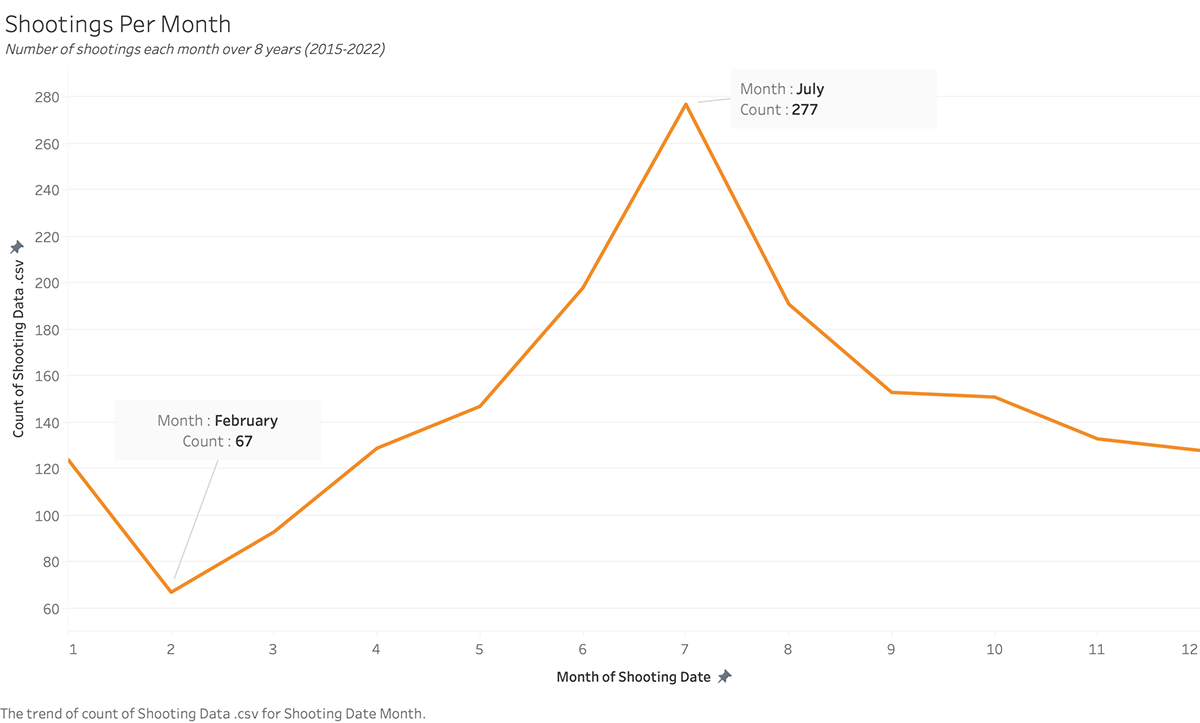

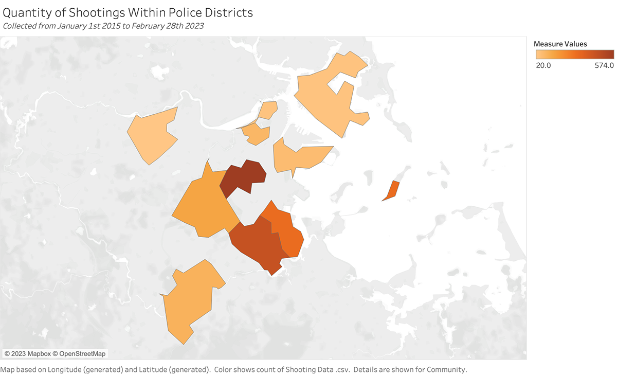
Things to know about the data, including limitations
This data provides a number of reported gun deaths and injuries, meaning that two different categories have been combined, which is a possible limitation in our data. For example, gun-related deaths are mandatory reports for sources such as the CDC, but gun-related injuries are not mandatory. For this reason, many of these instances may go unreported and uncounted within our data. It would also be helpful to know if suicide was considered “gun violence.”
Rachele Gardner, Manager of Strategic Partnerships and Civic Impact at the Engagement Lab, explained some of the positive aspects of Boston and the state of Massachusetts that may not necessarily be shown through the numbers provided.
“I think it’s important to distinguish that Massachusetts is often spoken about as one the safest states and Boston is one of the safest cities in the country based on firearm fatality rates…We also have one of the best hospital systems in the country to treat firearm injuries.”
Despite having relatively low instances of gun violence in the city, Gardner elaborated on the limitations of this data.
“There’s no mandatory reporting on firearm injuries. Just because firearm fatality rates are low doesn’t necessarily reflect gun violence or the number of gun violence incidents. So that’d be one area that could be expanded upon.”
Gardner also noted a lack of data pertaining to retaliatory violence. This is in regards to whether or not these are isolated incidents, other violence that led to gun violence was in self-defense, and how many of these incidents are from the same people.
“We know that one violent incident often leads to another based on the need to protect, retaliate, etc… So that could be another thing to explore.”
Other Stories, Reports, and Outputs from this Data
Rachele Gardner is also involved in a program called The Transforming Narratives Of Gun Violence (TNGV) initiative. This is a partnership between Emerson College’s Engagement Lab, the Center for Gun Violence Prevention at Massachusetts General Hospital, and the Louis D. Brown Peace Institute. Their goal is to get the public informed about the effects on those impacted by gun violence.
“And what we’re doing is we’re interrogating the dominant narratives of gun violence and what harm those dominant narratives do to communities who are most directly impacted by gun violence,” Gardner said. “and we seek to co-create new narratives that reaffirm the humanity and dignity of all people and tell the stories that are untold as it relates to gun violence in order to imagine new solutions to the problem.”
Gardner explained that the main component missing from the data is the “actual stories."
“People’s experiences... You can’t see that in the numbers. You can’t fully understand an issue by only looking at the numbers; you need to hear the stories that represent those numbers,” Gardner said.
Last spring, this group produced a documentary called Quiet Rooms, which highlighted the experiences of mothers who lost children to gun violence.
Supplementary Information
Authors of this Data User Guide
Maile Blume: https://maileblume.wordpress.com
Neve Chambers: https://nevechambers.myportfolio.com/
Adam Spector: https://58thstreetmedia.com/
Assignment 7 - Coded Bias
Assignment :
Write a blog entry of approx 1,000 words about the movie.
Use these questions as a guide: What was your favorite part? Are any assumptions being made in the movie Are there suitable examples What is missing? Are any groups excluded or marginalized in the text, or are the implications of the claims? How does this movie relate to my personal experience? Why are they significant to this class?
“Coded Bias” is a documentary film that follows the experiences of MIT computer science researcher and activist Joy Buolamwini’s journey to discover why her face is unrecognizable in many facial recognition systems. Spoiler Alerts: It’s because of her skin color. Directed by Shalini Kantayya, it discusses the bias built into the data we are using to code the next steps in the technology world. It explores the effects of artificial intelligence (AI) bias and its impact on society. The data sets that are currently in use are built around white males and are highly biased against people of color, women, and other marginalized groups. The film also highlighted the consequences of biased AI, including discriminatory hiring practices, racial profiling, and police surveillance by profiling individuals based on their race, religion, or other characteristics. This is leading to unjust treatment and violations of privacy and civil liberties. They interview experts within fields of computer science, civil rights, and privacy, who offer their perspectives on the issue and propose solutions to mitigate AI bias.
The most fascinating part to me was when they traveled to London to work with the Big Brother Watch. Especially when they revealed that 98% of facial recognition matches are in fact incorrectly matching an innocent person as a wanted person. These numbers are astronomically high and should serve as a wake-up call for the technology industry and society as a whole to take responsibility for the potential harm that biased AI can cause. This portion of the film also highlights how globalized this problem is, comparing the US & UK to China as a communist state.
Author of Weapons of Math Destruction, Cathy O’Neil, is featured many times throughout this documentary as she is also known as a mathematician and data scientist. O’Neil discusses her concern about the blind faith we have in big data as our history is embedded in this data and our data is exactly impartial. In her own words, the data “embeds the dark past, not just the recent past” and our dark past is built on structures of systemic racism. Buolamwini continues this by stating that social factors can not be separated from technical factors, and every day people embed their own biases into technology.
Another detail that the film brings to light is how much AI can perpetuate systemic discrimination and exacerbate existing inequalities in society. The film does primarily focus on facial recognition technology and does not address other areas where AI bias can have significant impacts, such as healthcare, education, or finance. One very powerful quote from Joy Buolamwini was “What does it mean if there is no one to advocate for those who aren't aware of what the technology is doing”. This shows how abstract the idea of artificial intelligence is for so many groups of people, and how the effects it can impact those who are not aware of it.
As data journalists, we must ensure that we are not only having this awareness but also trying to mitigate any harm that our work could cause. Towards the end of the film, Buolamwini states “Intelligence without ethics is not intelligence at all” which to me really stood out as we should be very careful and aware of our own ethics and the ethics of those we are trying to represent with our data and stories.
“Coded Bias" is a thought-provoking and insightful film that raises important questions about the future of AI and its impact on society. It serves as a reminder that as we develop new technologies, we must remain vigilant in ensuring that they are fair and equitable for all.
Assignment 8 - Finding a Story
Assignment :
Based on the presentation, create a story using data found/researched by you and describe what type of story. You can work on any data that interest you. Create a process-oriented blog post that shows the following:
- Your pivot table, maps, timelines, and other charts show your process.
- Propose an angle for your data story based on your exploration & analysis
Remember to state the TYPE of data story (based on the 5 types of data stories). If you don't think it fits one of those types, propose a new type of data story.
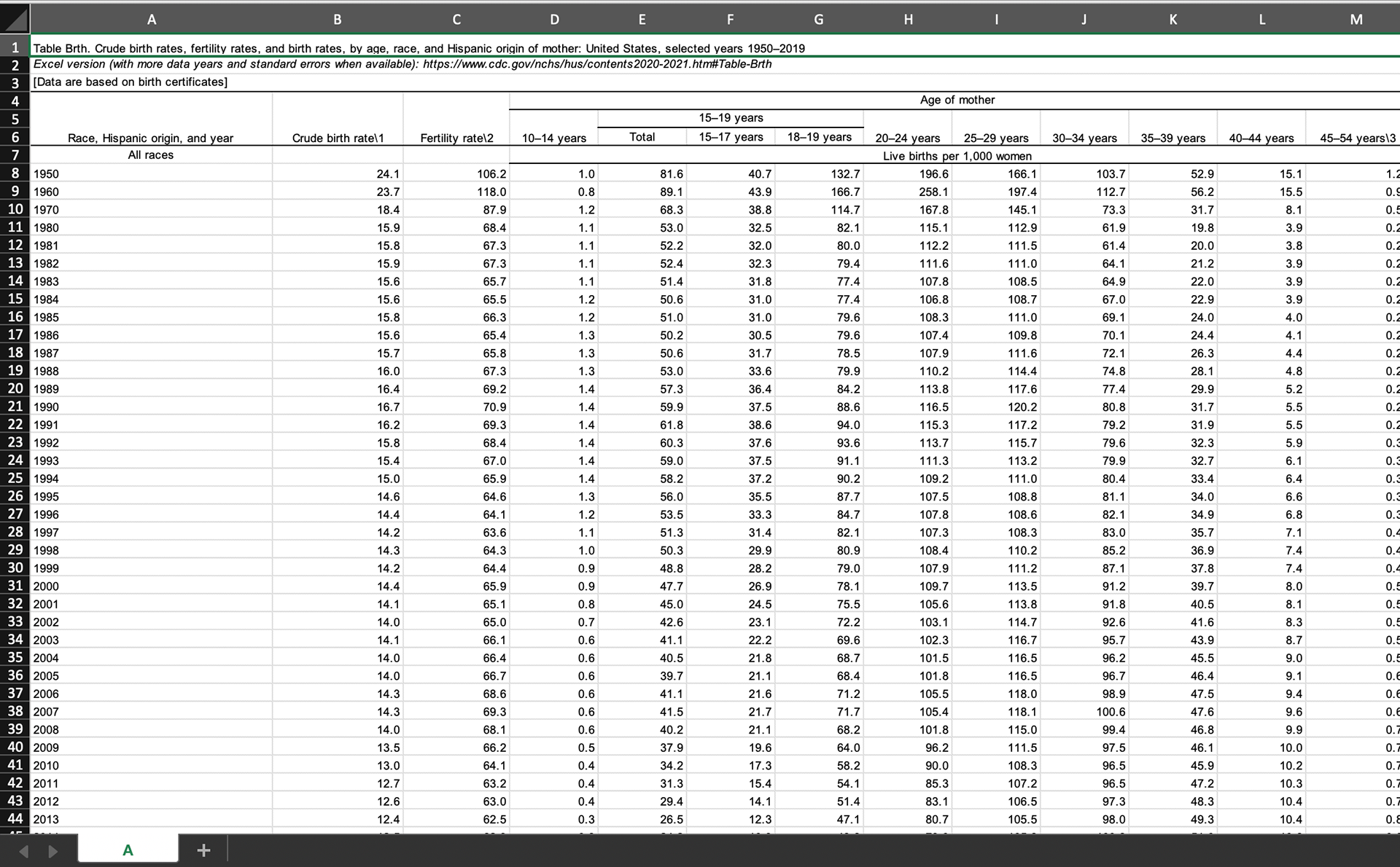
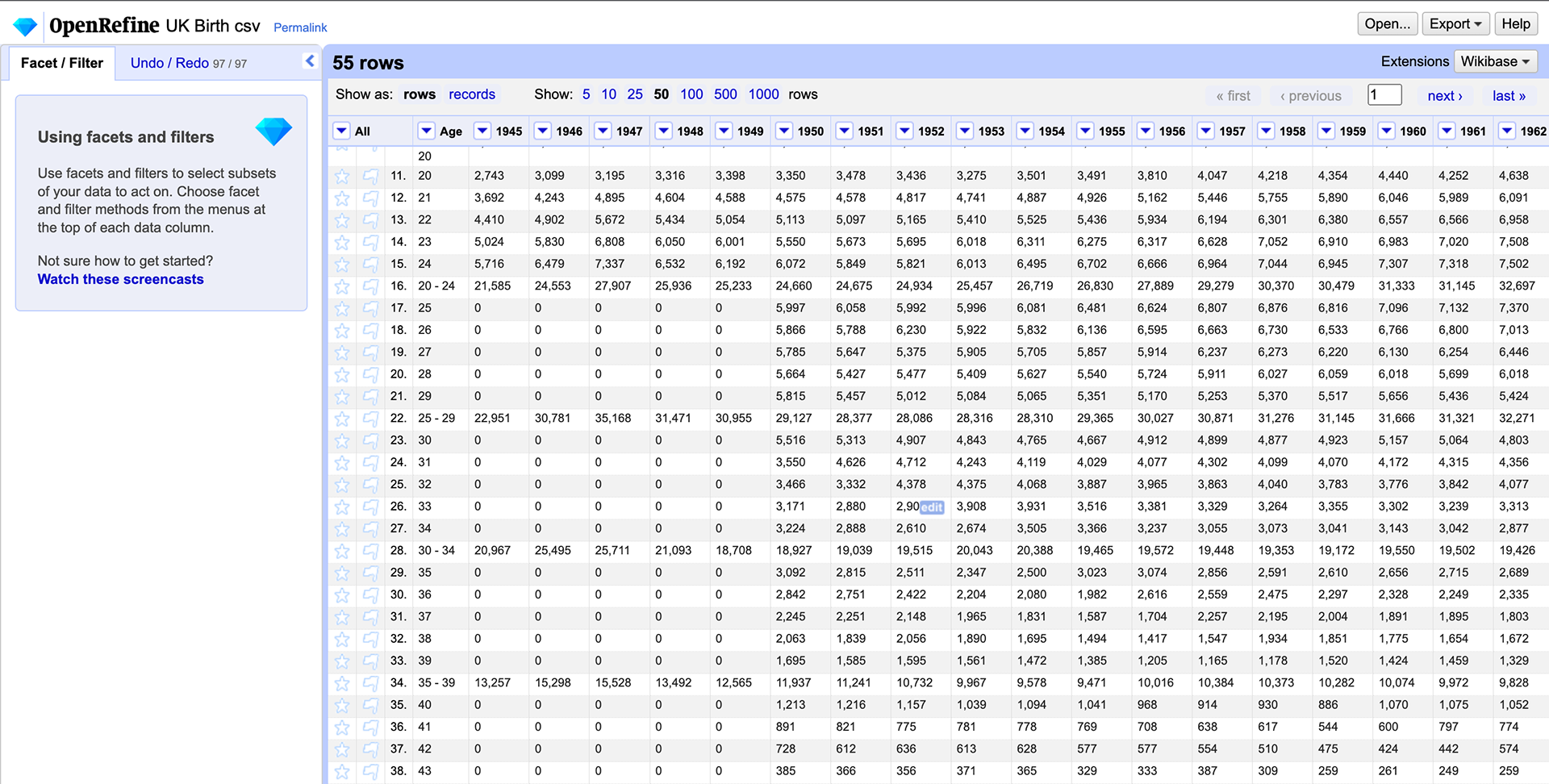
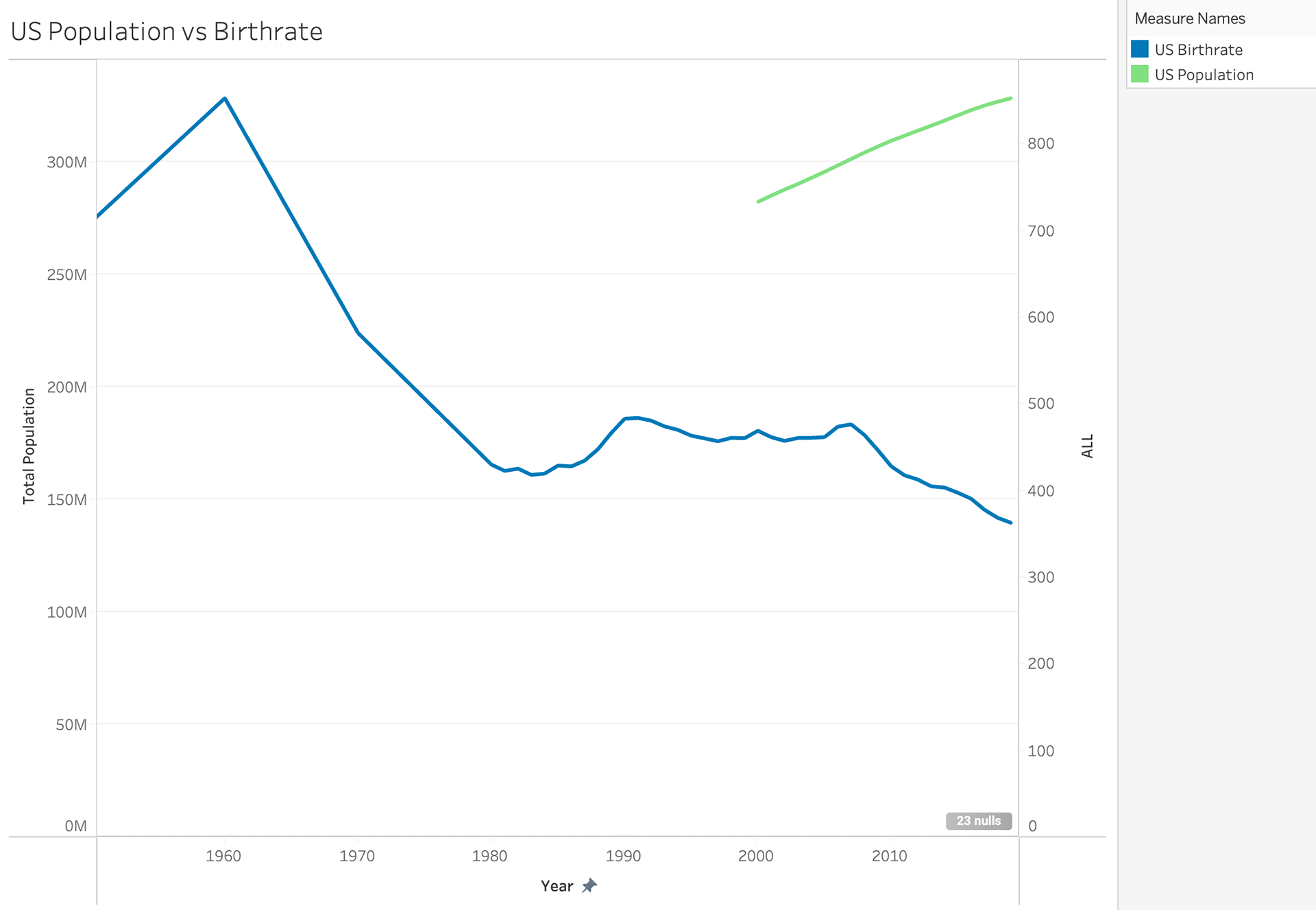
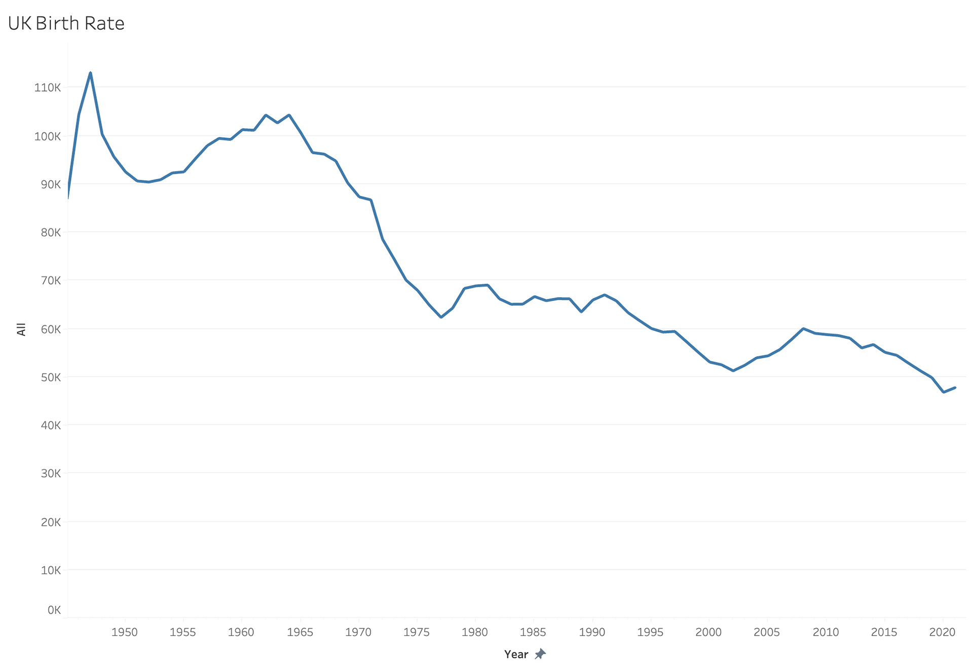
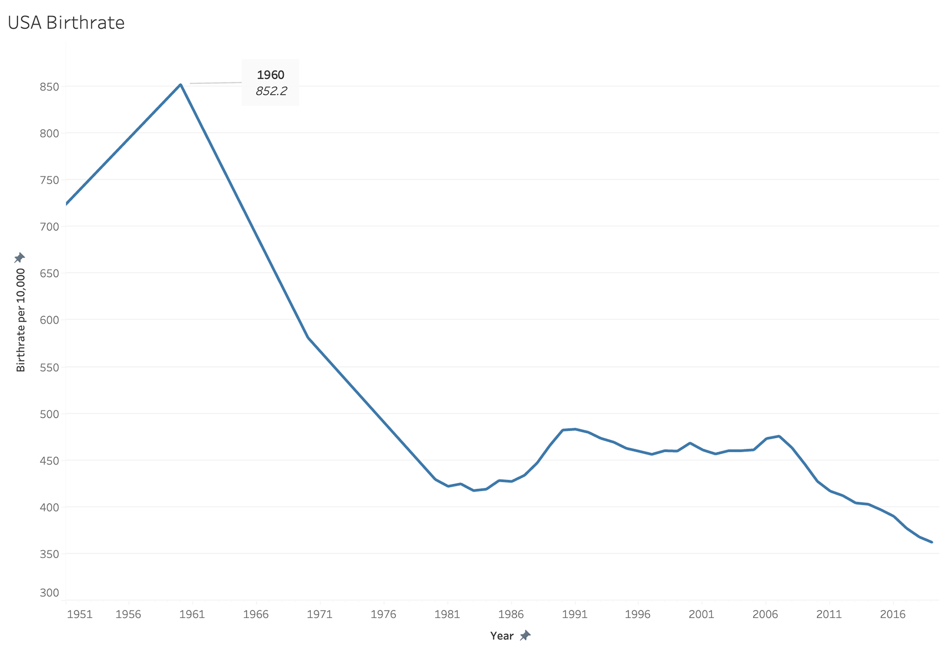
I really struggled to decide what I wanted to study for this assignment, I knew because I was in the UK while doing this I wanted to compare some information between the US and the UK. I decided upon studying birth rates. When trying to compare birth rates there are no standardized methods. Some countries use births per 10,000 people; others use a straight number.
I really struggled to decide what I wanted to study for this assignment, I knew because I was in the UK while doing this I wanted to compare some information between the US and the UK. I decided upon studying birth rates. When trying to compare birth rates there are no standardized methods. Some countries use births per 10,000 people; others use a straight number.
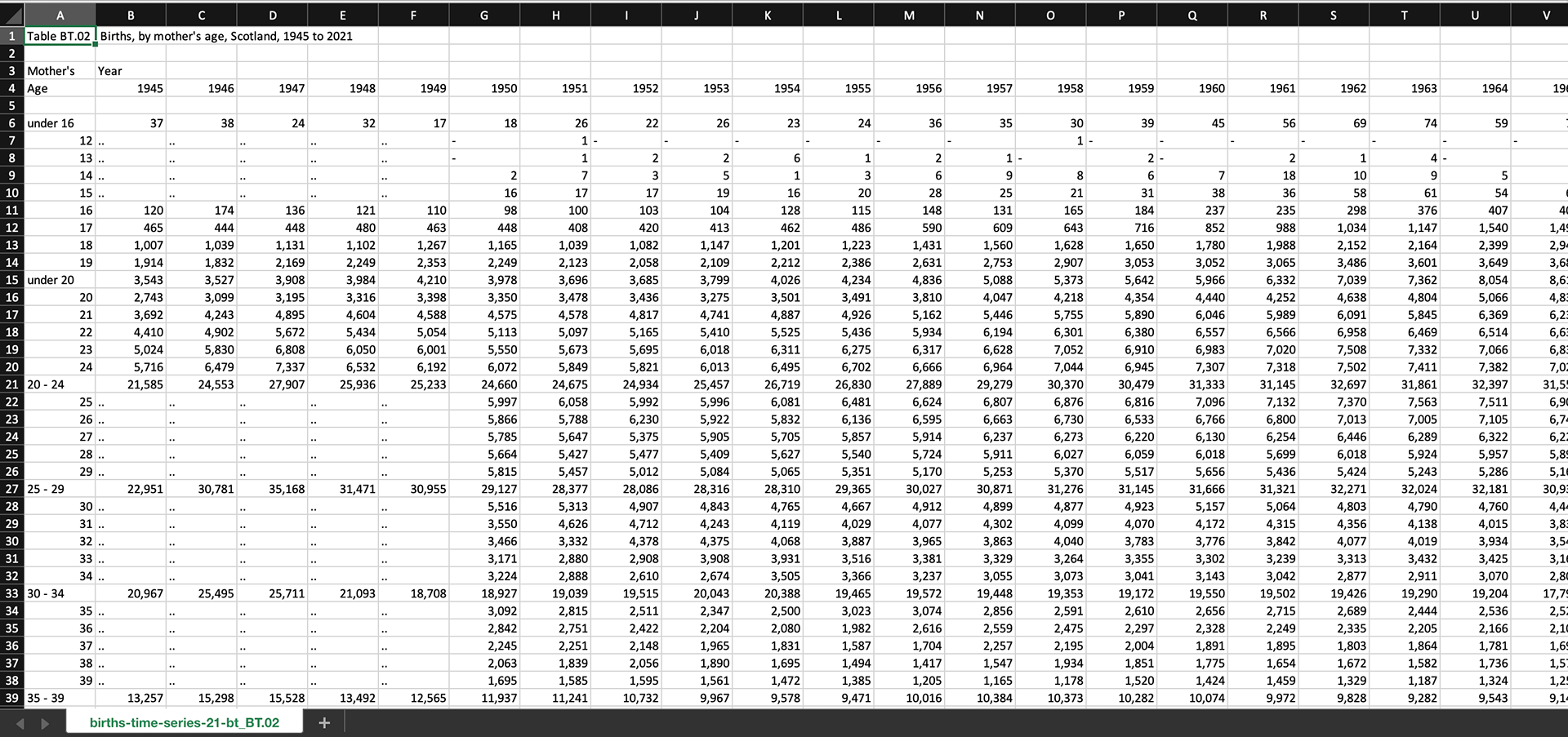
UK Raw Data
US Raw Data
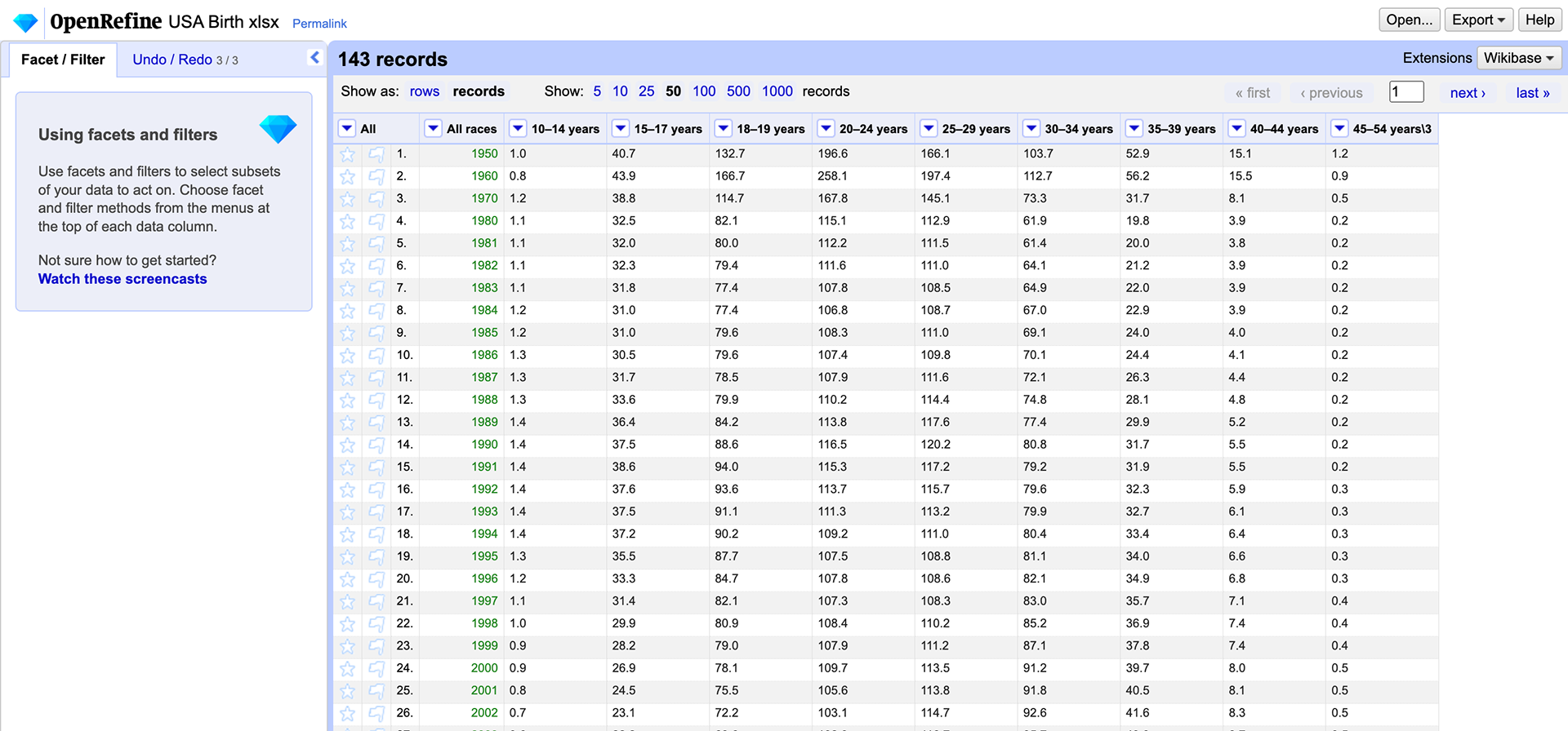
UK Open Refine Process
US Open Refine Process
The more I worked through this I really acknowledged how much this data needed some form of normalization to ensure they are accurate. We don't necessarily need data to tell us that the USA is MUCH bigger than the UK. Below is the population rate of both the UK and the US. It is easy to see that the UK population has grown much steadier than the US.
My next step was to try and analyze the birth rates in these countries as well before I could compare the birth rates to the population rates. It wasn't until I put these together I realized how off and skewed my data was.
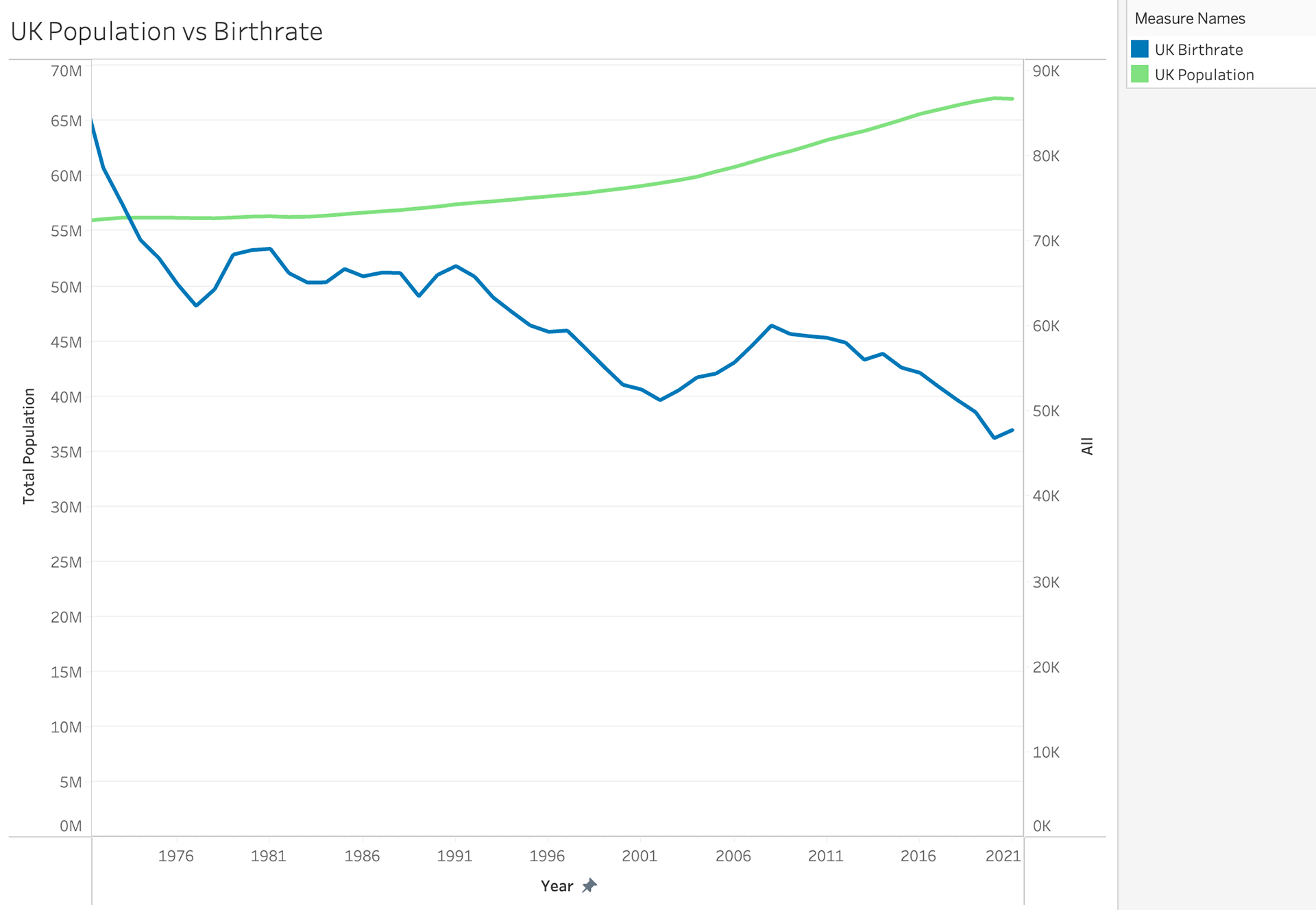
I tried to work through a normalization style to bring the UK birth rate to the same format as the US birth rate.

